
BeInCrypto takes a look at Bitcoin (BTC) on-chain indicators, more specifically the HODL wave. This is done in order to determine the percentage of coins held by short-term holders.
What is the HODL wave?
The HODL wave shows the ratio of the BTC that has moved in a specified time period. This is done relative to the total supply of BTC. Therefore, if the HODL wave band of 1-2 years has a range of 15%, it means that 15% of the total BTC supply last moved 1-2 years ago.
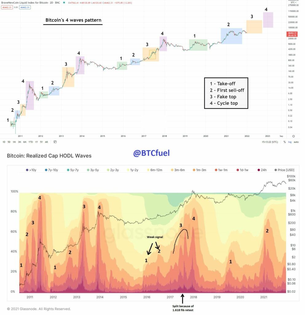
BTC enthusiast @BTCfuel tweeted a graph of the HODL wave. It shows a pattern that has continued since 2011. In it, BTC cycles are made up of four stages, each with its distinct characteristics.
In this article, we will take a detailed look at the HODL wave indicator and analyze its values.
Short-term movement during the top
What is immediately noticeable when looking at indicator readings since 2011 is that the bands between 1 day and 3 months bulge significantly near market highs.
In 2011, these bands reached a high of 97%. In 2013-2014, they moved above 90% twice. However, in 2017 they only moved above 80%, while they barely moved above 70% in 2021.
This means that the majority of BTC supply has moved over the past three months very close to the highs of the market cycle. This is likely to happen as a result of market strength selling off to young hands.
Another observation is the fact that the percentage of total supply that moves as the BTC price approaches a top has been steadily decreasing each market cycle, from 97% in 2011 to 72% in 2021.
Therefore, there are more and more long-term holders (or lost coins) who do not take profit during the highs of the market cycle, but instead continue to hold.
Finally, the percentage of coins that have moved over the past three months was only 40% during the current all-time high price of Nov (black circle). This is unlike previous market cycle tops.
Who owns and who sells?
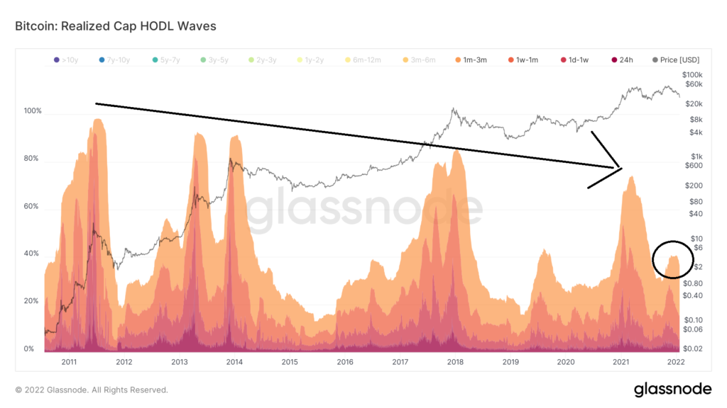
The two bands that have increased the most are the 6m-12m bands (yellow) and the 1-2 year bands (light yellow). Both have been widening since July 2021, when they accounted for 5.11 and 4.23 percent of total supply, respectively.
Currently, coins that last moved between 6m-12m represent 32% of the total supply, while those that moved between 1 and two years ago represent 10% of the total supply.
Therefore, 32% of the total supply of BTC was last moved between January and August 2021, when the price hovered between $35,000 and $50,000 (black circle). Thus, parts purchased during this period are not sold at a loss. This is evident by the fact that the short-term bands do not swell.
In addition to this, coins last moved between 1-2 years encompass 10% of the total supply. During this period, the BTC price was between $8,000 – $30,000. Therefore, these holders are still in profit, but have not taken profit during the run-up to the all-time high.
This is a sign that these holders have conviction and have not taken profit during these massive price swings.
Finally, similarly to how short-term bands swell close to market cycle tops, the swelling of the 6-24 month bands has historically been associated with periods of accumulation.
After the highs of the previous market cycle, the bands up to 24 months held over 60% of the total BTC supply. What followed thereafter was a major price rally, during which these holders sold for a profit. This, in turn, caused the bands to decrease.

To conclude, when combining these short-and long-term bands, we can arrive at the conclusion that the current composition of short- and long-term holders is more akin to a period of accumulation rather than that of a market cycle top.