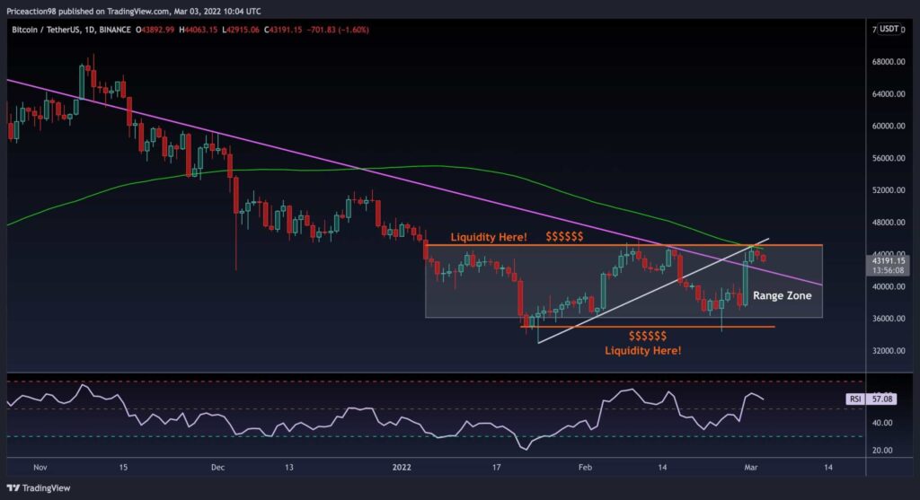
The past seven days had been a blast for Bitcoin, after soaring to the top of the trading range between $34K and $46K. However, it got sharply rejected, reaching the resistance zone amid the $45K area, along with an ascending trendline.
Technical analysis
Long term: the daily chart
Currently, there is potential selling liquidity above the $46,000 area and considerable buying liquidity below the $35,000 area.
Moreover, there is an apparent divergence between the price and the RSI on the 1-hour timeframe, which has led to the correction we witness now.
The price must form a higher low to continue the uptrend. Additionally, Bitcoin broke above the multi-week descending trendline (marked in purple on the following chart), then was rejected by the 100-day moving average line, and is now retesting it as support. If support holds, then another bullish leg could be seen.
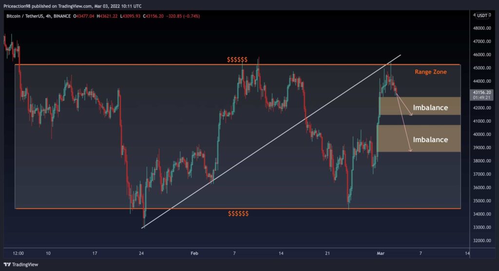
Short-Term: The 4-Hour Chart
On the 4H timeframe, two apparent imbalance areas are located in the $41.5K – $42.8K and $38.6K – $40.6K regions. Both might serve as possible support.
As many technical analysts would agree, the market will almost always correct these imbalances when prices rise dramatically. As a result, the market can be expected to experience some near-term volatility as liquidity is absorbed by lower price levels ahead of any further upside.
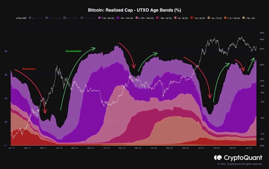
Onchain Analysis: Realized Cap – UTXO Age Bands
Over the past two years, the most dominant sentiment of international affairs has been “uncertainty.” And there is one place that hates uncertainty more than anywhere else: Financial Markets.
From a global pandemic to inflation concerns and, recently, geopolitical conflict, all have been catalysts for many volatile phases over the past two years.
In these periods of uncertainty, it is often advised to zoom out and observe the big picture. The following chart demonstrates, for instance, a big picture of Bitcoin’s supply dynamics since its first block.
This metric is called Realized Cap – UTXO Age Bands (%), and it visualizes different groups of coins based on their age (the last time they were moved) and their share of the total realized cap. Here, coins aged from 3 months to more than ten years are shown and separated by different colors specified in the chart legend.
In summary, a rise in these age bands shows HODLing and accumulation (green), and a drop in them shows selling and distribution (red) by the mid-term to long-term holders.
The market is currently in an accumulation phase, with the number of coins last moved more than three months ago rapidly increasing. This type of holder behavior is promising and signals that despite short-term volatility, the continuation of Bitcoin’s bullish megatrend is somewhat inevitable.